
Real-Time Infrastructure Monitoring Dashboard
Polycom Aqua
Problem
Engineers responsible for real-time communication infrastructure need to determine within seconds whether a region is operating normally or moving toward failure.
In many monitoring tools, critical signals are scattered across multiple dashboards. To assess system health, engineers must manually correlate utilization, packet loss, and setup failures across disconnected views.
This slows investigation, delays response, and makes early warning signs easier to miss.
The goal was to design an interface that makes a region’s operational status immediately visible and helps engineers decide where to investigate next.
Key questions the interface should answer:
Is the region healthy or degraded?
Which metric triggered the warning?
What is the most likely cause?
Which nodes are affected?
Where should investigation begin?
Users
The primary users are SREs and infrastructure engineers responsible for maintaining real-time media systems.
Their work is operational, time-sensitive, and signal-driven. During incidents, they need to quickly assess whether a region is stable, identify early signs of degradation, and determine where investigation should begin.
Typical tasks include:
Monitoring system capacity
Detecting saturation risks
Diagnosing likely failure causes
Identifying affected nodes and segments
Investigating active incidents
The interface must support rapid scanning, clear prioritization, and confident decision-making under pressure.
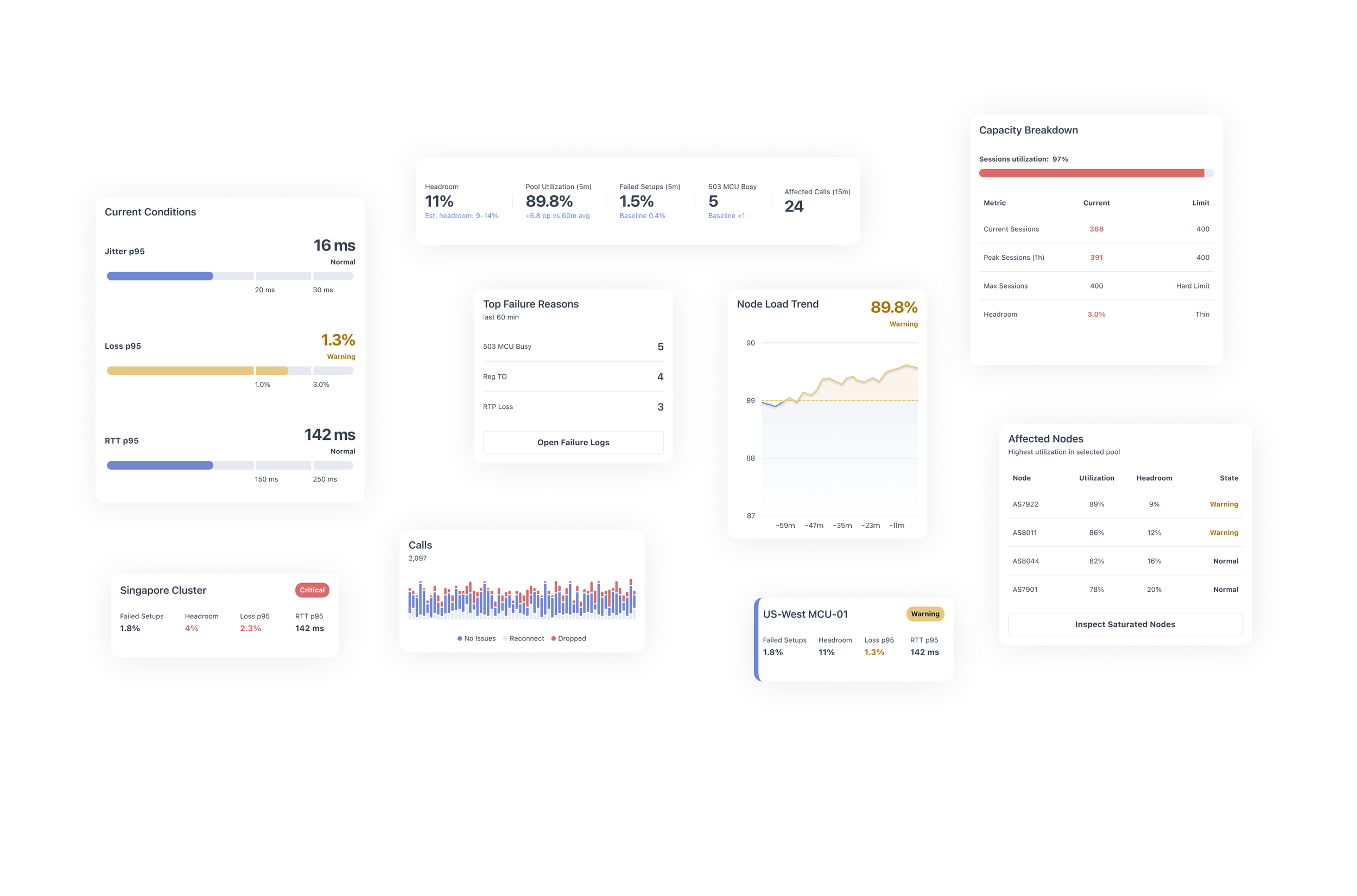
Defining Key Metrics
Designing an operational monitoring interface begins with identifying the signals that engineers rely on during incidents.
The goal was not to display as many metrics as possible, but to highlight the smallest set of indicators that reveal early signs of system degradation.
Through domain exploration and discussions around typical incident scenarios, several key signals were selected. These metrics fall into three categories:
Capacity signals – show whether the system is approaching its limits
Quality signals – reflect media performance and user experience
Failure signals – reveal the causes and scope of degradation
Together, these indicators allow engineers to quickly assess system health and determine where investigation should begin.
-
Pool utilization represents the percentage of capacity currently consumed by active sessions within a region or node pool.
This metric acts as the primary early-warning signal for saturation.
As utilization approaches the upper thresholds, the system becomes less capable of handling sudden traffic spikes or unexpected failures.
Typical interpretation:
<70% – healthy operating range
70–85% – elevated load
>85% – risk of saturation
>95% – likely capacity exhaustion
In the interface, utilization is surfaced prominently to allow engineers to immediately detect rising load.
-
Headroom represents the remaining capacity available before the system reaches its maximum supported session count.
While utilization shows current load, headroom answers a different operational question:
How much traffic can the system absorb before it fails?
Low headroom indicates limited resilience. Even a small traffic spike may trigger failures.
Operationally:
>25% – safe margin
10–25% – moderate risk
<10% – high risk of capacity exhaustion
Headroom is displayed alongside utilization to provide a clearer understanding of remaining operational buffer.
-
Failed setups represent the percentage of session initiation attempts that fail during call or media session establishment.
Unlike infrastructure metrics, this indicator directly reflects user-facing impact.
A spike in failed setups often signals that:
capacity limits have been reached
session allocation has failed
infrastructure nodes are rejecting new sessions
Monitoring the deviation from baseline values helps engineers determine whether the problem is systemic or temporary.
-
Packet loss measures the percentage of media packets that fail to reach their destination.
The p95 percentile is used to highlight worst-case user experiences while ignoring small outliers.
Elevated packet loss can indicate:
network congestion
overloaded media processing nodes
routing issues
degraded network paths
Because packet loss directly affects audio and video quality, it serves as a critical signal for detecting degraded media performance.
-
Two additional metrics help evaluate network performance.
RTT (Round Trip Time) measures the time it takes for packets to travel between endpoints and return.
Higher RTT values increase call latency and reduce responsiveness.
Jitter measures variation in packet arrival times.
Unstable jitter can cause:
audio distortion
buffering
inconsistent media playback
Together, these metrics help engineers distinguish between capacity-related issues and network instability.
-
Top Failure Reasons
Operational dashboards must quickly surface the root causes behind failed sessions.
Instead of forcing engineers to inspect raw logs, the interface aggregates the most common failure reasons within the last time window.
Examples include:
503 MCU Busy
Indicates that the media control unit cannot accept additional sessions due to capacity limits.
This typically occurs when node pools are saturated.
-
When degradation occurs, engineers must identify which infrastructure components are responsible.
The Affected Nodes list highlights nodes with the highest utilization or lowest remaining capacity.
Each node entry includes:
current utilization
available headroom
operational status
This allows engineers to quickly identify whether the issue is isolated to specific nodes or affects the entire region.
From there, further actions may include:
redistributing traffic
draining saturated nodes
investigating infrastructure anomalies
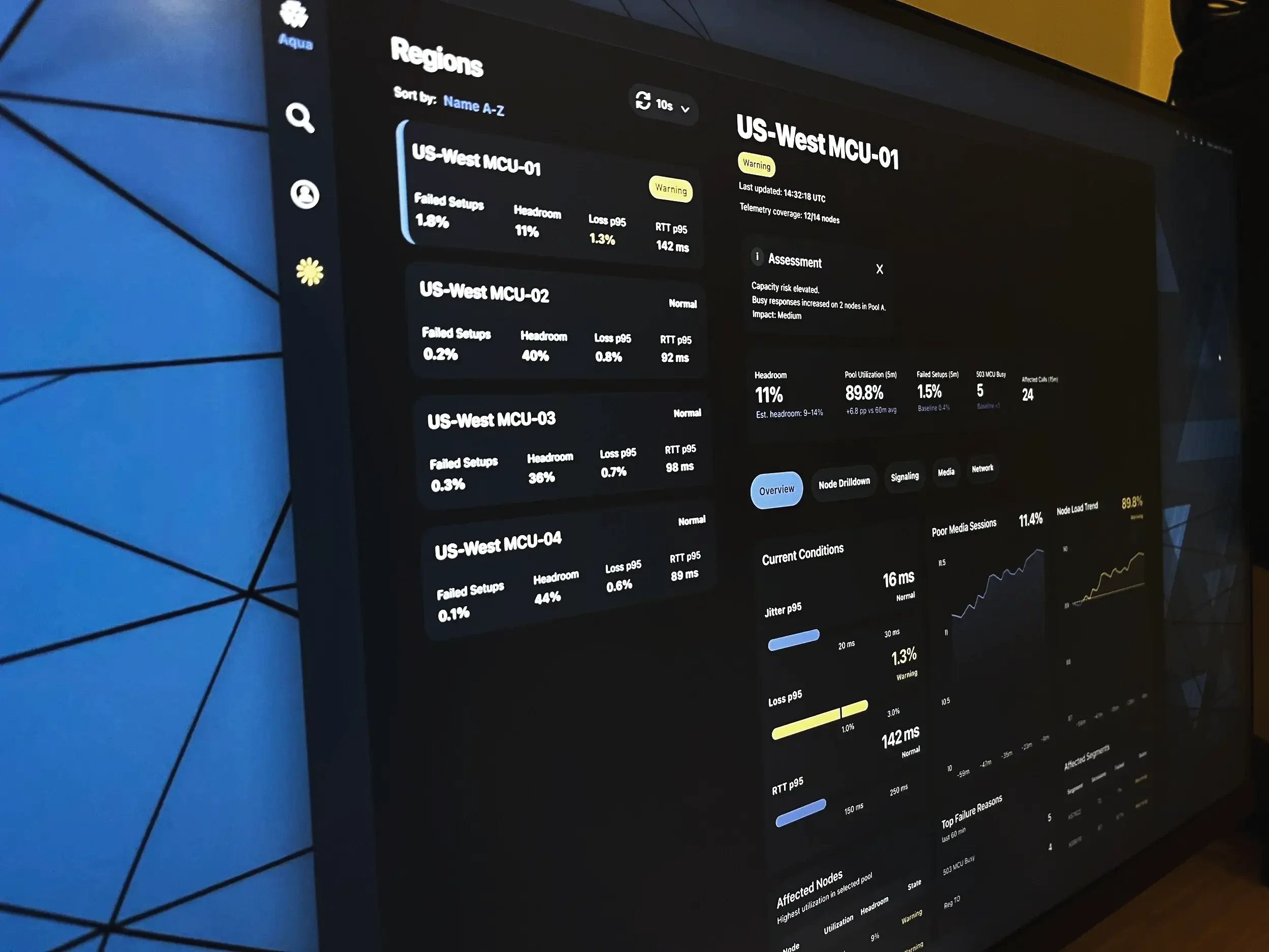
Information Architecture
The dashboard is structured to support rapid operational scanning. Its layout follows the sequence engineers typically use during incidents: first confirming overall region health, then evaluating critical metrics, reviewing trend direction, identifying affected infrastructure, and narrowing down likely failure causes.
This top-down hierarchy reduces cognitive load by placing the most decision-critical signals first and supporting progressive investigation.
The interface reflects a practical incident workflow:
Detect the problem
Assess impact
Identify the likely cause
Locate failing components
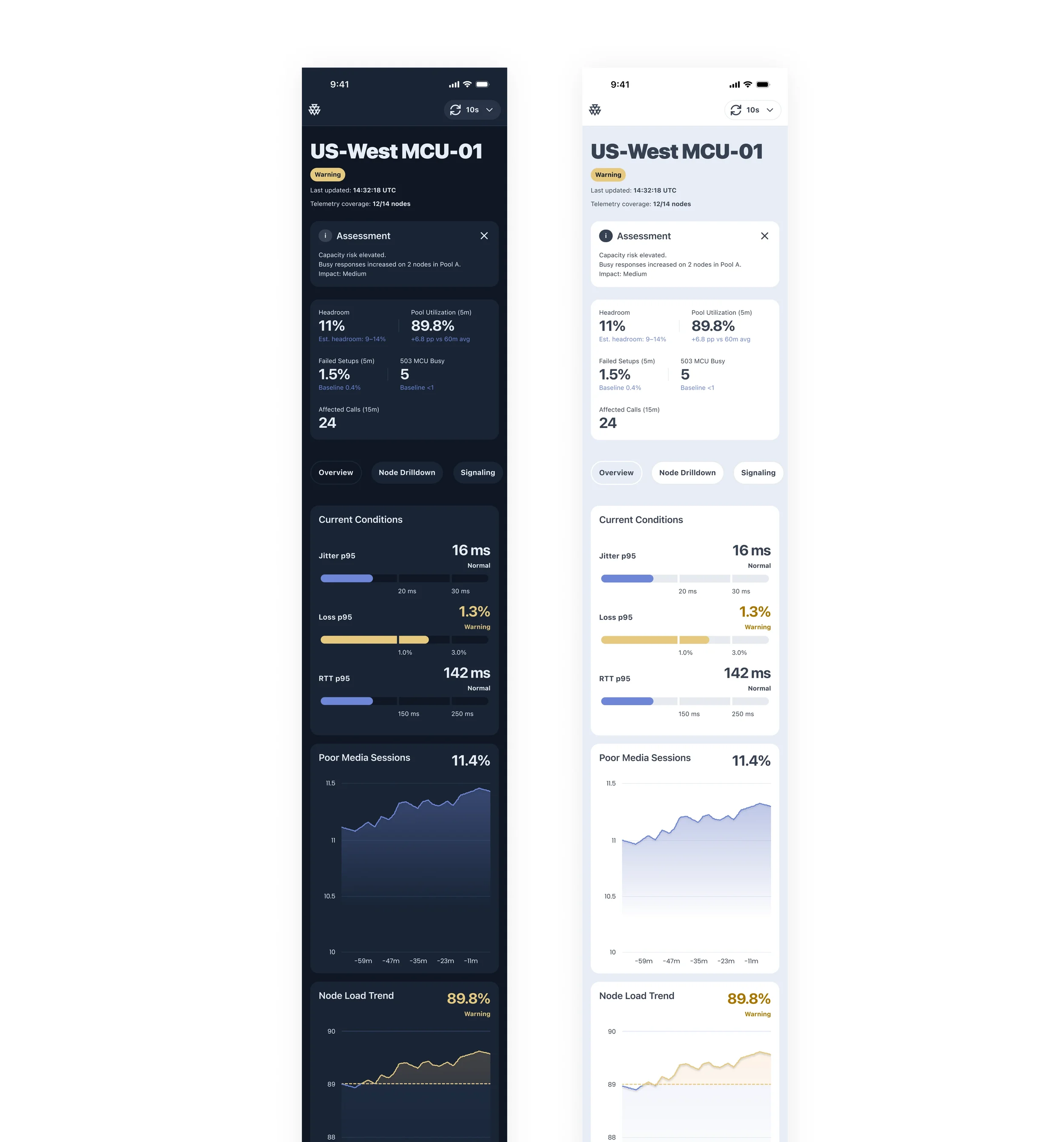
UX Decisions
The interface was designed to reduce scan time and make operational signals immediately actionable.
Clear operational status — a persistent status indicator makes region health visible at a glance
Metric-first layout — key signals are surfaced as primary numeric values before secondary detail
Trend context — short-term trends help distinguish temporary spikes from sustained degradation
Failure cause visibility — likely causes are surfaced directly instead of being buried in logs
Infrastructure visibility — affected nodes are listed alongside headroom and state indicators to guide investigation
This structure helps engineers move from detection to diagnosis without switching context.
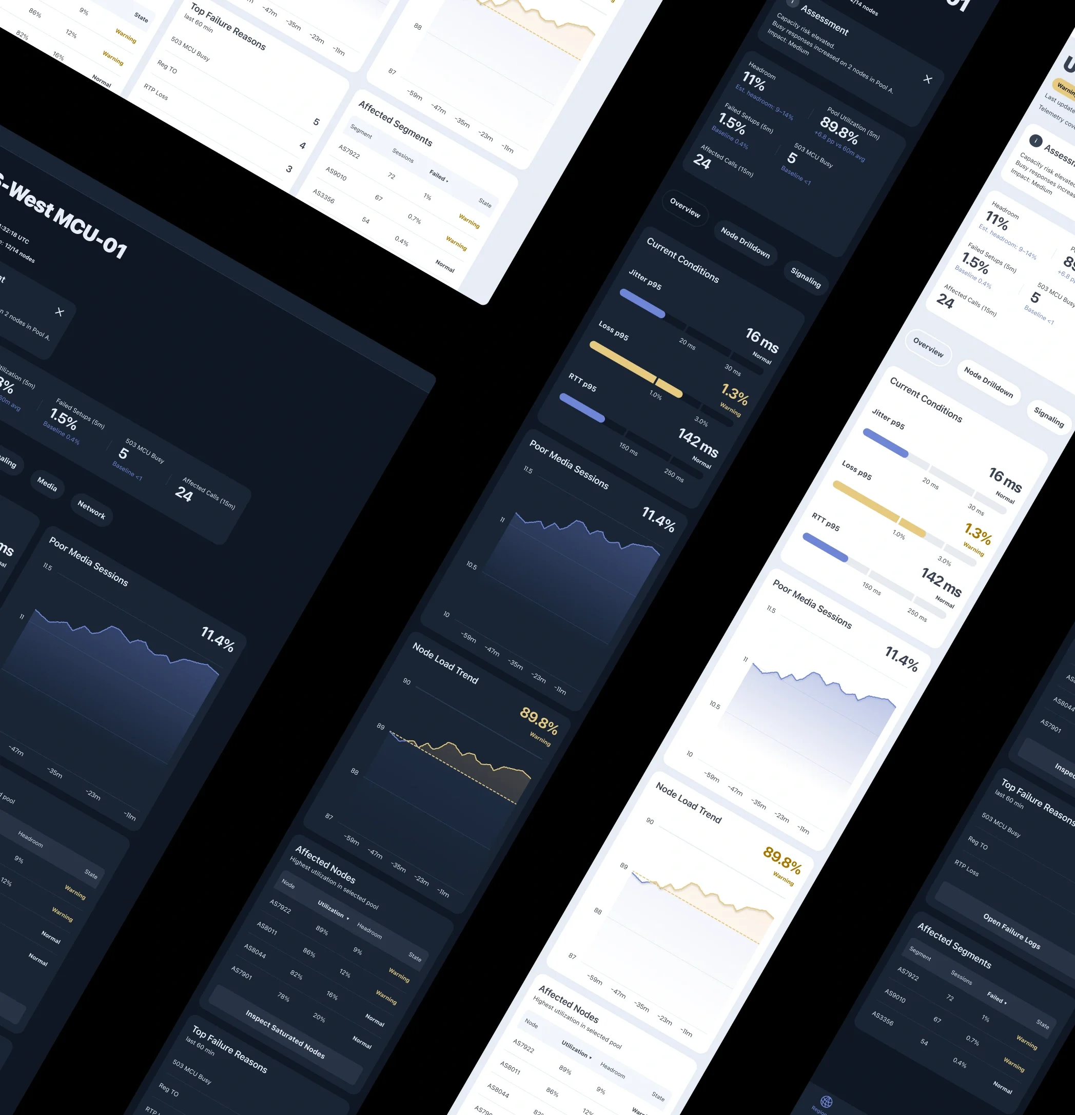
Visual Design Principles
The interface is designed for fast operational reading. Its visual language prioritizes clarity, signal visibility, and immediate interpretation over decoration.
Dark Theme
A dark palette supports prolonged monitoring sessions, reduces eye strain, and creates strong separation between panels.
Status-Driven Color
Color is reserved for system state. A limited palette distinguishes:
Normal
Warning
Critical
This keeps alerts visible and reduces visual noise.
Minimal Graphs
Charts emphasize trend direction and threshold proximity rather than visual detail.
Clear Hierarchy
Strong typography and restrained secondary styling make critical values easier to scan first.
Outcome
The result is a monitoring interface designed to make regional system health immediately understandable during live operations.
By combining status visibility, critical metrics, trend context, and failure signals in a single operational view, the dashboard helps engineers detect risk earlier, identify likely causes faster, and focus investigation where it matters most.
The project explores how monitoring tools can become more actionable when information is structured around real incident workflows rather than scattered across disconnected views.
The final interface demonstrates a practical approach to reducing scan time, improving signal clarity, and supporting faster operational decisions in high-pressure environments.