Introduction
Reviver RPLATE is a digital license plate ecosystem that rethinks how drivers manage registration, personalization, parking, and vehicle-related services. The product turns a traditionally manual and fragmented experience into something more connected and easier to use.
My role focused on improving usability across key flows while also bringing more structure to the design process itself. This meant designing clearer end-to-end experiences, reducing friction in critical tasks, and helping build a component-based system that made the product more consistent and scalable.
Research and Understanding the User
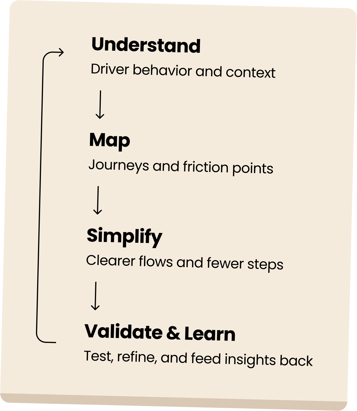
Reviver RPLATE was a complex product to design because it reimagined something deeply traditional — the license plate. Throughout the project, my focus was on understanding user behavior, identifying friction points in the vehicle registration experience, and translating those insights into clearer, more intuitive product decisions. I looked closely at how drivers move through tasks related to registration, account setup, and plate management, with a strong emphasis on usability in moments that are often time-sensitive or stressful. This helped shape a product experience that felt simpler, more connected, and easier to navigate — while also revealing clear advantages unique to a digital plate.
Prototyping and Usability Testing
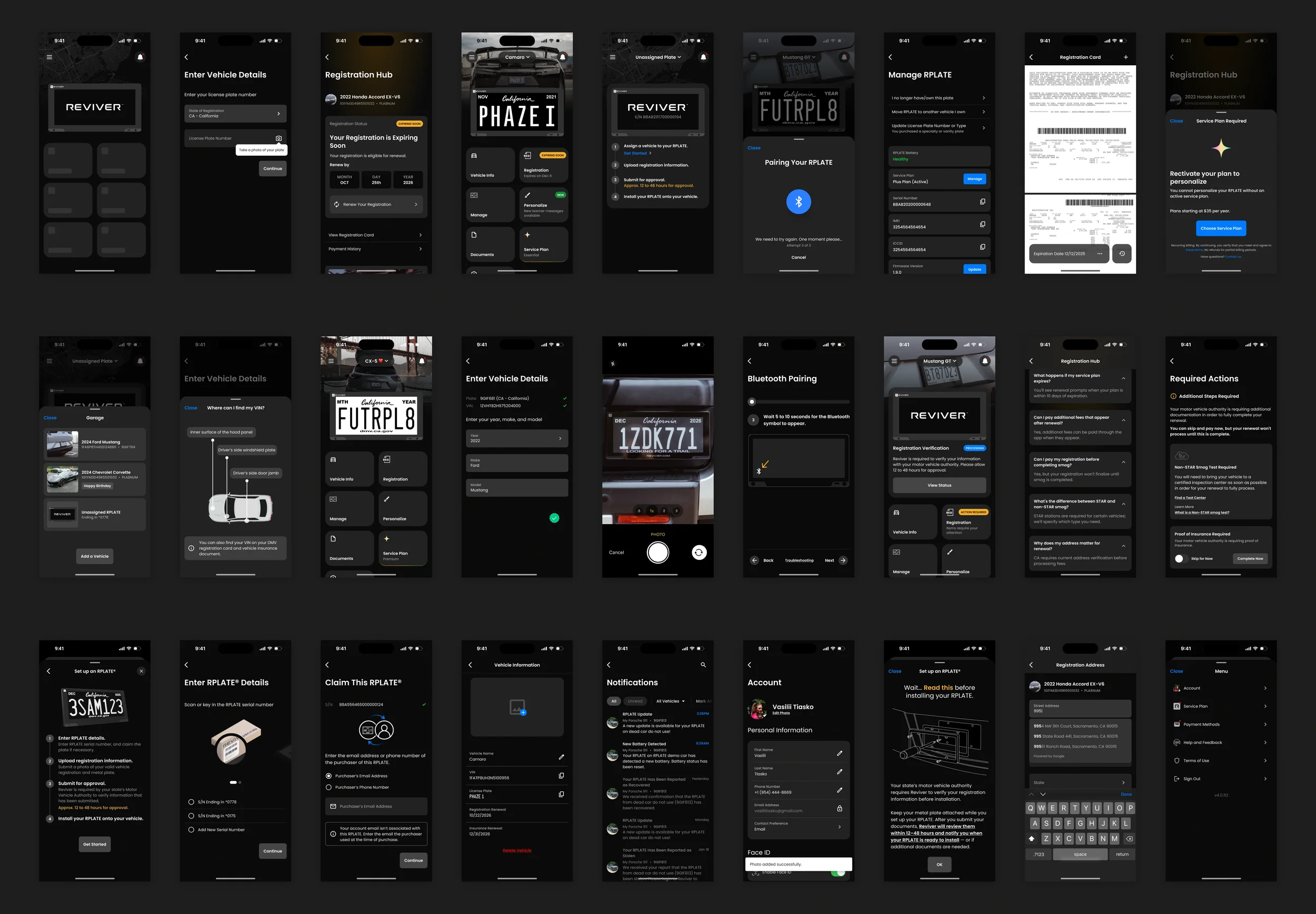
High-fidelity prototypes helped bring the RPLATE experience to life across key moments of the journey — from setup and registration to customization, management, and support. By testing these flows with users, I was able to spot friction points, improve clarity, and refine interactions where the experience needed to feel especially simple and dependable. The result was a product that felt more intuitive, cohesive, and easier to use in everyday situations.
Modular Figma File Structure
This approach made the work easier to maintain, scale, and communicate by separating reusable components, polished screens, and end-to-end user flows into distinct Figma files. It improved consistency across the product, simplified updates, and made collaboration with stakeholders and developers more efficient.
Mob DS lib.fig
As part of my Figma workflow, I built and maintained a dedicated Design Library that centralized the product’s core elements, reusable components, and platform-specific patterns. It also included organized references for key app areas such as onboarding, home, Bluetooth, account, and plate management. This structure helped keep the system consistent, scalable, and easier to use across both design and product development.
App Views.fig
The App Views file brought together complete product screens built from the Design Library, helping translate reusable components into fully realized user interfaces. It was used to organize key areas of the app, review screen-level decisions, and maintain consistency across the product as features evolved.
App Flows.fig
The App Flows file was used to map end-to-end user journeys across the product, connecting individual screens into clear and actionable experiences. It helped define how users moved through key tasks such as onboarding, registration, plate setup, account management, and support-related scenarios. Organizing flows in a separate file made it easier to identify friction points, review logic across states and edge cases, and communicate the overall experience more clearly with product and engineering teams.